The Challenge
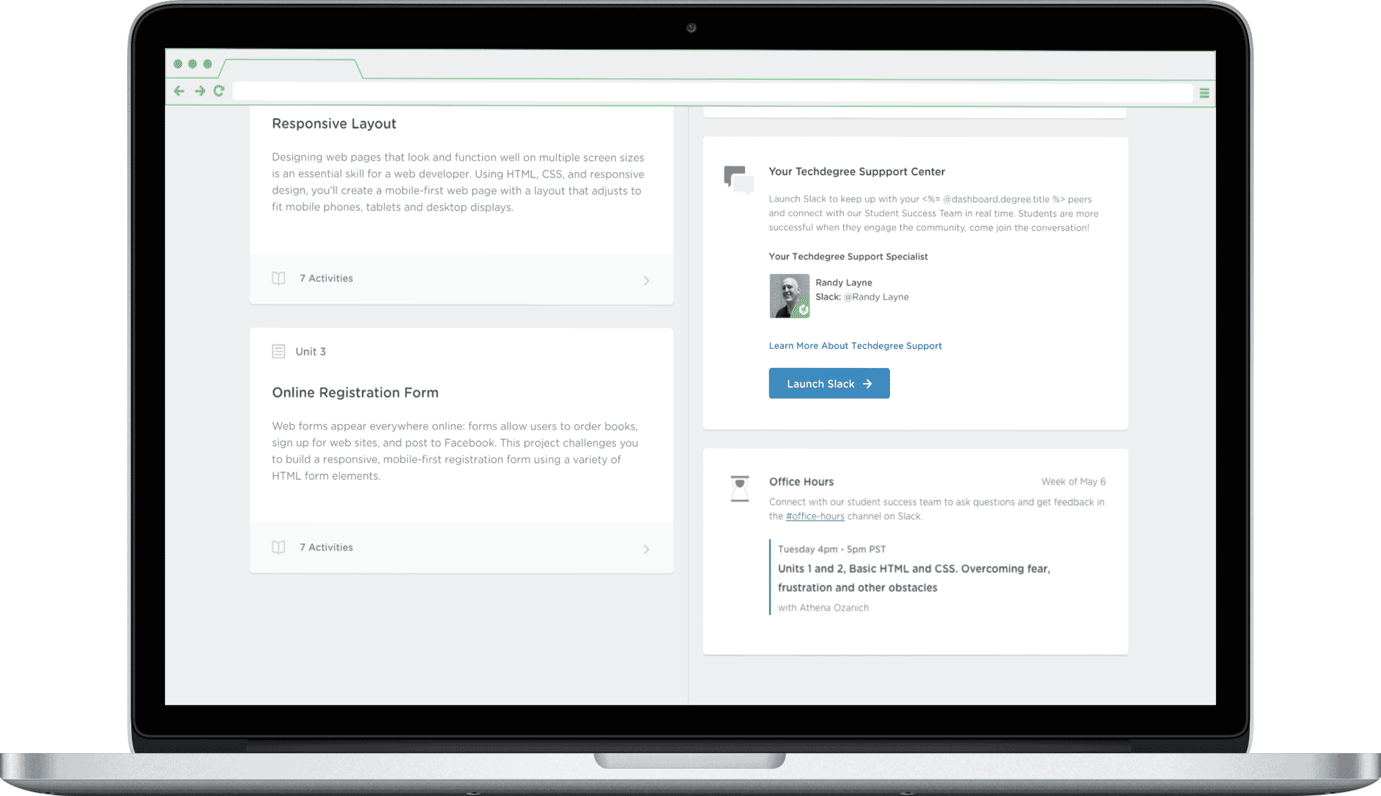
Despite robust content and structured learning paths, student engagement with Techdegree's live support systems (like office hours) was abysmally low—often under 20%. Through interviews and data analysis, we uncovered the real problem:
It feels connected and informational, but I still don't know who to talk to.
— A former Techdegree student
Students weren't failing for lack of effort. They were failing alone.
Key Insight
We studied a cohort of "Bright Spot Students"—those who succeeded despite the same constraints. The pattern was clear:
- They joined Slack early
- They attended office hours regularly
- They built social accountability through light community touchpoints

Our design hypothesis became clear:
Increasing visibility and approachability of live community tools (especially office hours) would improve conversion, retention, and student outcomes.
Design Approach
As the sole designer on this project, I owned the end-to-end experience — from student research to stakeholder alignment to final handoff. I facilitated cross-functional reviews, ran iterative prototyping sessions, and led the design critique that landed on the final Slack CTA and dashboard layout.
Lifecycle Mapping
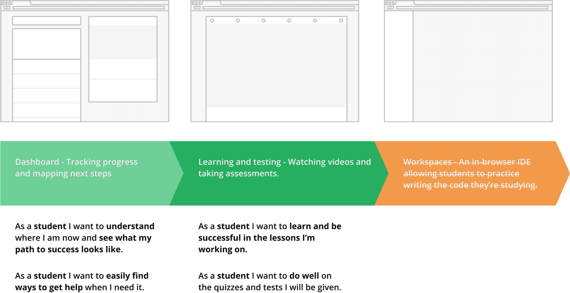
We mapped all student entry points and touchpoints to identify highest-leverage changes...
Minimizing Anxiety Through Design
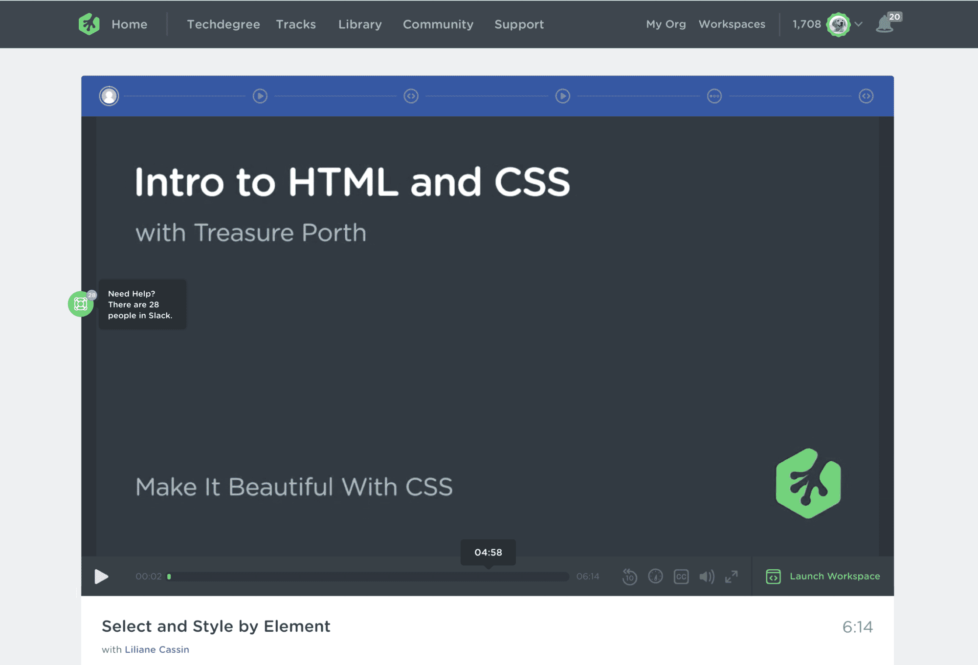
Slack isn’t obvious or intuitive to everyone. And in educational contexts, asking for help can feel risky — especially for new or underrepresented students.
But among our Bright Spot Students, Slack wasn’t just a channel — it was the backbone of their support network. So we focused not on replacing it, but on making its benefits feel more visible, human, and immediate.
Supporting At-Risk Students through Behavioral Triggers
We noticed that students who dropped off early in the program often cited confusion or second thoughts — not dissatisfaction. We explored gentle retargeting strategies using behavioral triggers (such as early inactivity) to offer support, course changes, or personal outreach without shame or pressure.

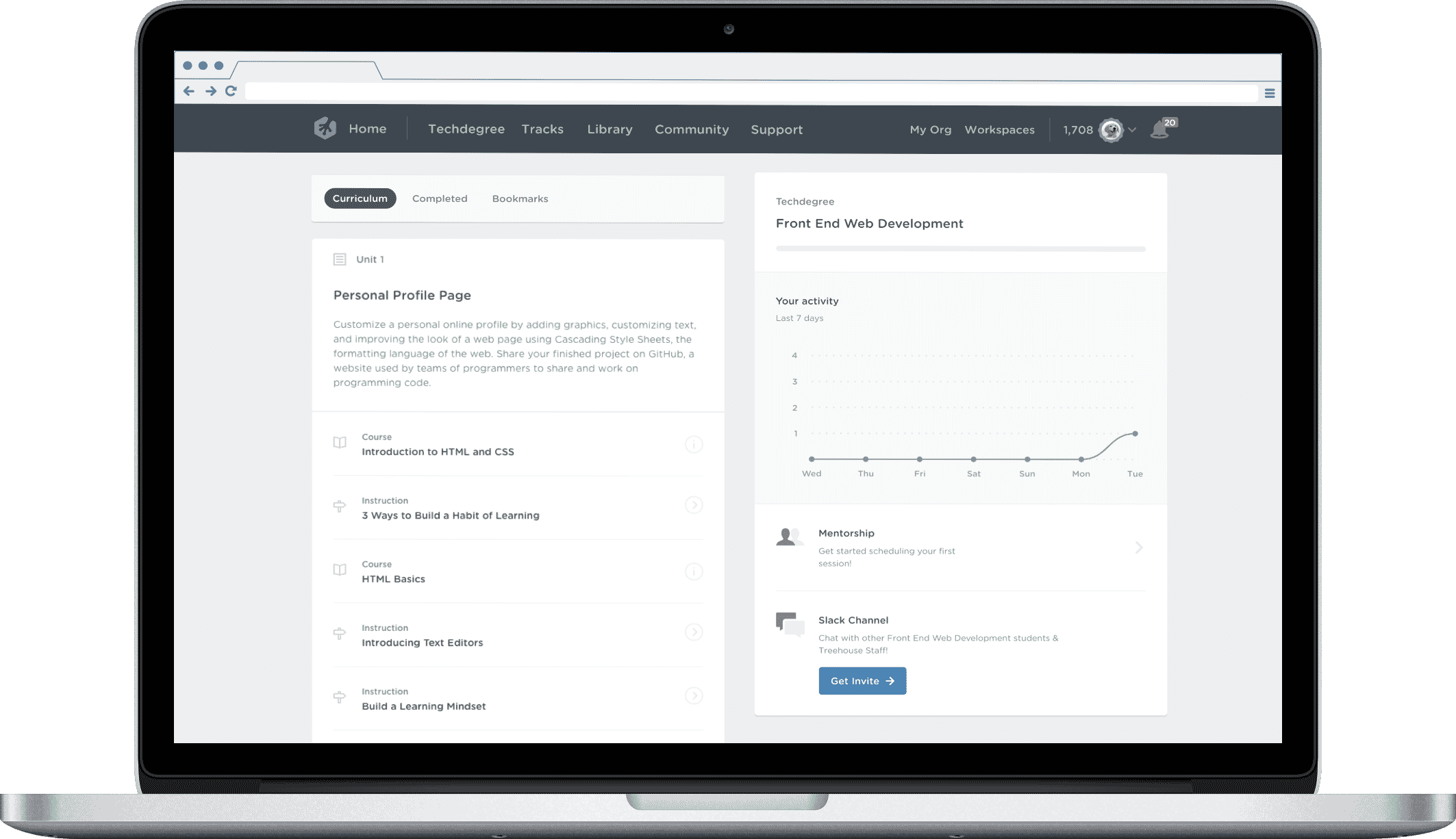
Before & After: Dashboard Evolution
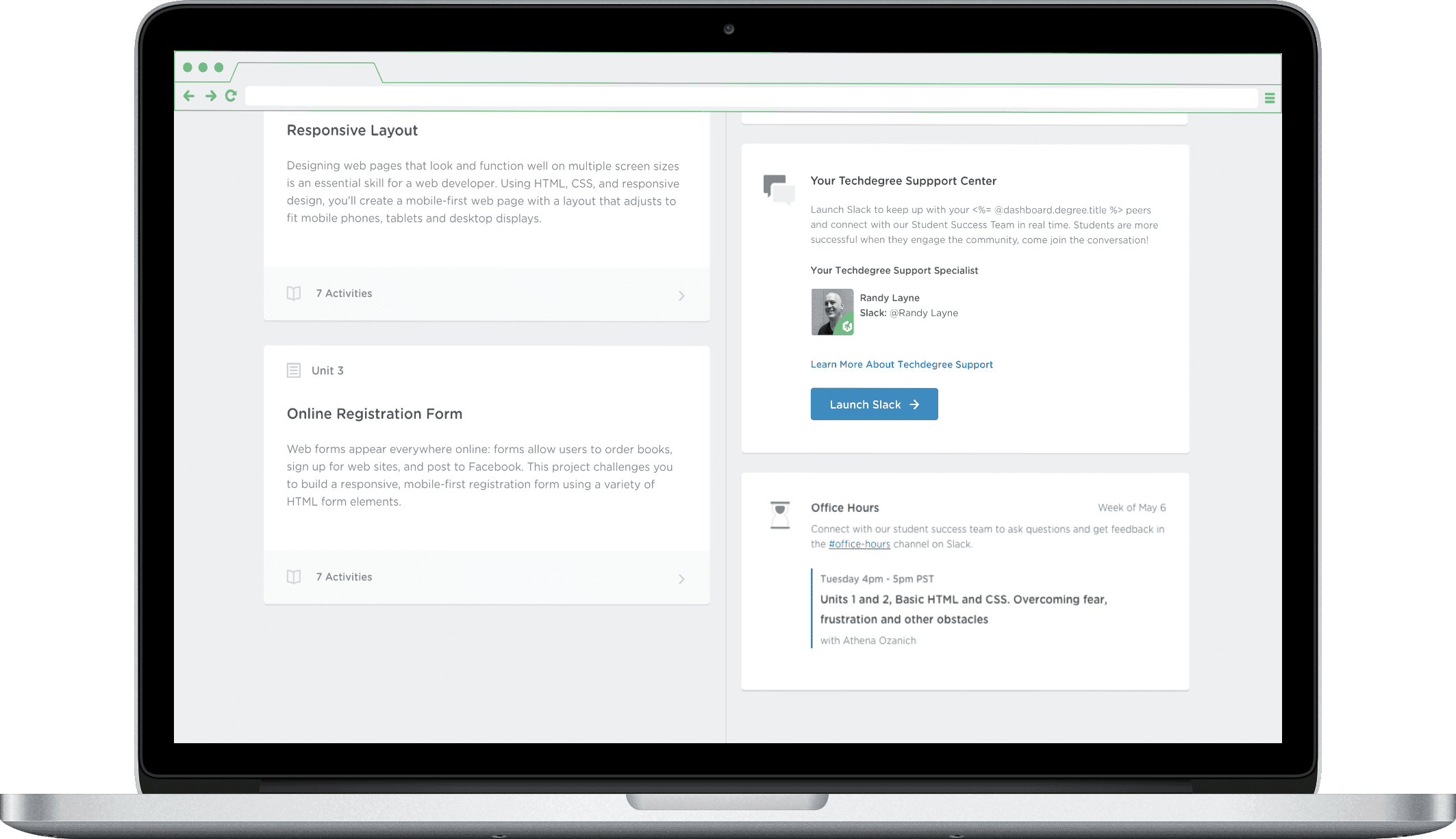
Tradeoffs & Decisions
While redesigning support visibility across the Techdegree experience, we made several key decisions to balance speed, feasibility, and student impact:
- Scoped MVP around Dashboard only — Legacy code in Workspaces would have created delivery risk. We focused instead on modern, high-traffic surfaces.
- Hardcoded schedules to validate need — Instead of building dynamic scheduling infra up front, we hardcoded office hours based on known availability. This let us launch faster and test demand with less cost.
- Prioritized familiarity over novelty — We avoided creating a new live chat system and leaned into Slack because it was already in use by successful students. Our job wasn’t to invent — it was to reduce friction.
The new dashboard made it easier to connect with students who actually needed help — we stopped guessing who was struggling.
— Techdegree Student Success Rep
Collaboration & Execution
- Partnered with Success Team to design around their bandwidth (we hardcoded initial schedules to validate demand before investing in automation)
- Co-led prioritization sessions with PM to validate high-impact surfaces
- Ran lightweight usability testing with students and exit interviews to assess clarity and usability
- Iterated rapidly with engineers to build a maintainable schedule backend post-MVP
📈 Outcomes
- +25% increase in office hour attendance
- 2 of 5 win-back rate in student interviews
- Improved Slack activation across new trial users
- Reduced Success Rep overhead via partial automation
Reflections
This wasn't just a UX upgrade — it was a trust repair. By making live support feel personal, available, and timely, we helped students re-engage on their own terms.
